We’re all about that base and by base we mean TEXTURES! Creating and applying high quality textures changes the game in CGI. We've all seen images where a pattern is repeated over and over. Images that just don’t look good. The PIX-US process is one that focuses on creating beautiful, photo-realistic images and texture creation is just step one. We’ve proven that our process works time and time again. With the help of our clients we make the best textures possible. Collaborating on this one step ensures that we create the highest quality staying true to product reality. So, what do we need to create textures? That depends on the product being created. Every situation is different so here are some examples: Product: Metal Light Fixture | Texture Creation: Small chip of metal material Product: Tile Flooring | Texture Creation: One piece of every pattern available Product: Upholstered Sofa | Fabric sample with one full pattern repeat (typically a yard) What if you already have textures and want to use them? Awesome! This is the case for a lot of clients and if you’ve had high resolution textures created, we may be able to use them. However, we can’t always use the digital files that others have created. If they aren’t high resolution, are uneven and can’t be tilled, or don’t meet the requirements listed above they won’t work for PIX-US images. In situations where you have usable files, we still will ask for a small sample of the product. Why are there so many parameters for texture creation? There are a lot of ways texture creation can go wrong and using bad textures results in things like uneven lighting, seams, and repeating patterns that can ruin a great image. We’ve worked hard to figure out the best and most efficient way to create textures, saving our clients time and shipping cost. This means that when we ask for a yard of fabric there’s a real reason! If you’re looking to work with PIX-US, then you like the way our images look. Achieving this look on your project requires a close collaboration in everything including getting the right...
1. To this colorful cafe in south Florida . . . 2. To this perfect patio in California . . . 3. To this gorgeous North Carolina beach front rental . . . 4. To this delicious wine and cheese tasting in Arizona . . . 5. To this fun summer pool in Colorado . . . If only we could, they are all computer generated!! For help making your dream images come to life, please give us a call! And head to our social media pages to check out more of our summer inspired images....
Last week our designer, Morgan, took over our social media! She spent the week going over all things tile. But if you missed it you’re in luck because we've put together a recap of everything that Morgan had to say. TUESDAY: MIMICKING ORGANICS Tuesday Morgan touched on different styles of tile and how they can be a great substitute for natural materials such as wood, granite, and metals. Of course these materials are very popular and have a great look but sometimes they require sealing and other maintenance where tile doesn’t. WEDNESDAY UNEXPECTED LOCATIONS Wednesday Morgan discussed how tile can be used outside of its traditional purpose. It can be used to add texture, color, and patterns to surfaces. She also showed us how tile can be a design tool even though “tile can often be an afterthought when planning a design project”. THURSDAY MIX & MATCH Thursday Morgan talked about using a tile mixture to break up grids and patterns. Using different sizes and colors can create a fun look that changes up the traditional look of tile. She also showed us an example of how different colored tiles can create shapes in an otherwise simple layout. ...
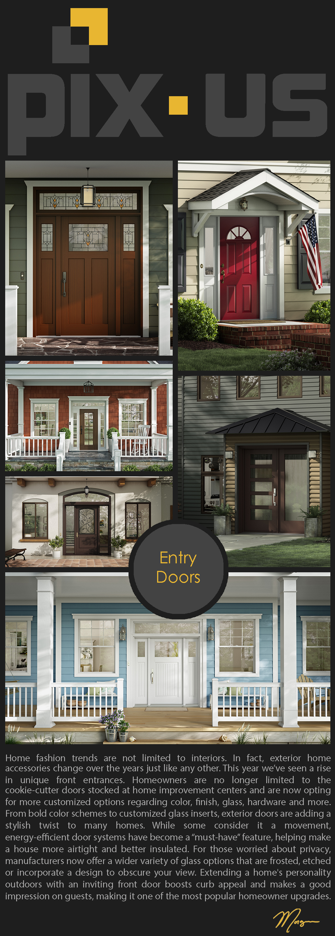
Click here to see all of the images in detail: https://pix-us.com/EntryDoors/...
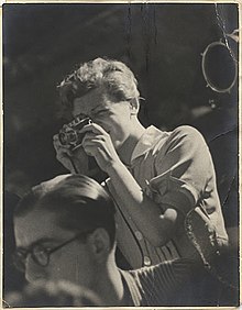
This is Gerda Taro, and today is her 108th birthday. She is a long forgotten war photographer and is credited as being one of the first ever woman photojournalist that captured the front line of a war, and died doing so. She was born on August 1st 1910 in Stuttgart, Germany to a Jewish family and fled Germany in 1933 after she was arrested for taking part in anti-Nazi propaganda activities, specifically handing out flyers. She eventually settled in Paris, France where she met her partner Andre Friedman (later known as Robert Capa). This is where she learned photography and helped create the alias “Robert Capa”. It was very difficult for foreign photographers to get their images into the French press so the couple came up with a very successful and rich American photographer that would create buzz and would help their photographs succeed. They both were very successful and captured a lot of crucial moments in the Spanish Civil War and Taro was known for putting herself in very dangerous situations just to capture an image. On July 25th, 1937 while returning from the front lines of battle she was crushed by and out-of-control tank and died the following morning (less than a week from her 27th birthday). Although she was largely forgotten for a number of years her work was a crucial part of the Spanish Civil war and was continued through her partner’s work. (Here is a small collection of Gerda's Images) Robert Capa is known as one of the most successful war photographers to date. Some of his best known and most influential images were the ones he shot at D-Day on June 6th, 1944. After a very successful career Capa later died in action by stepping on a landmine on May 25th 1954. So overall Gerda is a pretty awesome woman that is finally getting some of the recognition she deserves. Setting the way for other women and photographers in general to be fearless and to follow their passion. If you want to learn more about Gerda and Robert here are some links: https://www.independent.co.uk/arts-entertainment/photography/gerda-taro-google-doodle-death-photography-war-capa-born-spain-a8471891.html https://www.cnet.com/news/google-doodle-honors-pioneering-female-war-photographer-gerda-taro/ https://www.icp.org/browse/archive/collections/gerda-taro-september-26-2007-january-6-2008 https://www.bbc.com/news/magazine-25108104 https://www.cnn.com/2017/03/15/europe/gallery/tbt-gerda-taro/index.html https://www.artsy.net/article/artsy-editorial-photographer-robert-capa-risked-capture-d-day-images-lost https://www.icp.org/browse/archive/constituents/robert-capa?all/all/all/all/0 https://www.youtube.com/watch?v=wISNDLNiNrg...
In 2017, Pantone’s Color of the Year, Greenery was a fresh, invigorating shade of green that reflected new beginnings surrounding the political turmoil of the 2016 Presidential Election. 2018’s Ultra Violet wasn’t chosen for its representation of power and wealth, but was selected to evoke a counterculture flair, a grab for originality, ingenuity, and visionary thinking. The color violet has been associated with royalty, power, and wealth for centuries. It’s elite status stems from the rarity and the extraordinary expense of dying fabric purple. Since only wealthy rulers could afford to buy and wear the color, it also became associated with individuality, uniqueness, and originality. Today, purple is still regarded as a bit of an “ooh” color. Purple’s rarity in nature and the expense of creating the color and has given purple a supernatural aura for centuries. Perhaps because of its heritage, it has never been a mainstream choice, which is Pantone’s reasoning for it being the 2018 Color of the Year. Ultra Violet is one of the more complex colors because it is a combination of two shades that are seemingly polar opposites – blue and red – and brings them together to create something new. It also escapes some of the easy descriptions of other colors – red is hot, blue is cool… but what is the quality of purple, exactly? In our current political climate, where red is linked with Republicans and blue with Democrats, purple is periodically identified as a symbol of bipartisanship — or, in the case of swing states, as a signifier of uncertain affiliation. Pantone hopes the blue and red, the colors used to designate America’s liberal and conservative politics, can become a more harmonious purple. Violet speaks to a global audience, not the left (red) or the right (blue), but everyone. Recall the Ralph Lauren ensemble that Hillary Clinton wore to deliver her official concession speech following the 2016 election: a slate grey suit, with a deep purple silk blouse and matching lapels. Clinton later explained the significance of the color in her book What Happened, writing “The morning after the election, Bill and I both wore purple. It was...
Minimalism has dominated the modern design world for far too long. For years, designers have adopted the ideals of elegance and simplicity. We’ve lived in the era of social media, embracing the Apple aesthetic, Helvetica font, and white walls. But whatever happened to bright colors, bold patterns, and your good old fashioned knick-knacks? If Marie Kondo’s “less is more” mentality is your idea of creative expression hell, you aren’t alone. There is a shift in desire to create spaces that don’t attempt to show the Instagram-worthy, picture-perfect environment. Many designers have been restless for change, and ready to take risks by welcoming the messy world of color, pattern, and texture. Less is a bore, more is more. Maximalism, while being the complete opposite of minimalist design, doesn’t necessarily imply clutter or that you’ll eventually end up on an episode of Hoarders. Maximalism is the idea of excess, luxury, and individuality. In an age where the internet has us communicating in all-caps, LOLs, and emojis, it’s no surprise that our sense of style has evolved to become just as hyperbolic. The trend is particularly taking hold in the interior design world, where we’re starting to see more bold upholsteries, elaborate patterns and embellishments. I myself am a big fan of the maximalist lifestyle, boasting mismatched furniture, numerous artworks created by friends, and countless candles that dominate my home. Whenever I am entertaining, visitors always comment on the surplus of doodads to look at, variety of soft blankets and pillows, and the overall cozy nature of the space. If I'd decorated in a minimalist style, there would be far fewer conversation pieces. Here are five ways to release your inner maximalist: I. ENERGETIC COLORS: Forget about those stark white walls, and embrace a bold and vibrant hue. While minimalism uses pops of bold colors here and there, maximalism embraces the use of color. II. BOLD PATTERNS: From the window to the wall, pattern can play a role anywhere in the room, but the layering of pattern on pattern may seem easier said than done. Pattern can seem overwhelming at first, so try starting small by incorporating some patterned throw pillows. Embrace the...
http://mailchi.mp/dfb606af03f7/a-halloween-challenge-from-pix-us?e=72f5f13757 [video width="922" height="690" mp4="https://pix-us.com/wp-content/uploads/2017/10/Halloween-Animation-01.mp4"][/video]...