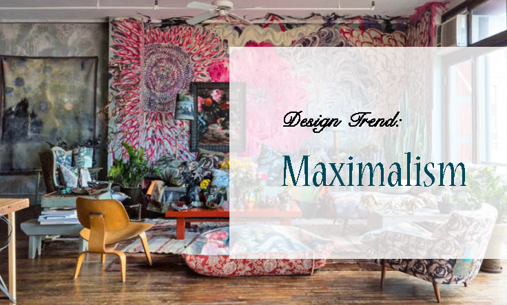
Design Trends: Maximalism
Minimalism has dominated the modern design world for far too long. For years, designers have adopted the ideals of elegance and simplicity. We’ve lived in the era of social media, embracing the Apple aesthetic, Helvetica font, and white walls. But whatever happened to bright colors, bold patterns, and your good old fashioned knick-knacks? If Marie Kondo’s “less is more” mentality is your idea of creative expression hell, you aren’t alone. There is a shift in desire to create spaces that don’t attempt to show the Instagram-worthy, picture-perfect environment. Many designers have been restless for change, and ready to take risks by welcoming the messy world of color, pattern, and texture. Less is a bore, more is more. Maximalism, while being the complete opposite of minimalist design, doesn’t necessarily imply clutter or that you’ll eventually end up on an episode of Hoarders. Maximalism is the idea of excess, luxury, and individuality. In an age where the internet has us communicating in all-caps, LOLs, and emojis, it’s no surprise that our sense of style has evolved to become just as hyperbolic. The trend is particularly taking hold in the interior design world, where we’re starting to see more bold upholsteries, elaborate patterns and embellishments. I myself am a big fan of the maximalist lifestyle, boasting mismatched furniture, numerous artworks created by friends, and countless candles that dominate my home. Whenever I am entertaining, visitors always comment on the surplus of doodads to look at, variety of soft blankets and pillows, and the overall cozy nature of the space. If I'd decorated in a minimalist style, there would be far fewer conversation pieces. Here are five ways to release your inner maximalist: I. ENERGETIC COLORS: Forget about those stark white walls, and embrace a bold and vibrant hue. While minimalism uses pops of bold colors here and there, maximalism embraces the use of color. II. BOLD PATTERNS: From the window to the wall, pattern can play a role anywhere in the room, but the layering of pattern on pattern may seem easier said than done. Pattern can seem overwhelming at first, so try starting small by incorporating some patterned throw pillows. Embrace the...