Pantone’s Color of the Year: Ultra Violet

In 2017, Pantone’s Color of the Year, Greenery was a fresh, invigorating shade of green that reflected new beginnings surrounding the political turmoil of the 2016 Presidential Election. 2018’s Ultra Violet wasn’t chosen for its representation of power and wealth, but was selected to evoke a counterculture flair, a grab for originality, ingenuity, and visionary thinking.
The color violet has been associated with royalty, power, and wealth for centuries. It’s elite status stems from the rarity and the extraordinary expense of dying fabric purple. Since only wealthy rulers could afford to buy and wear the color, it also became associated with individuality, uniqueness, and originality. Today, purple is still regarded as a bit
of an “ooh” color. Purple’s rarity in nature and the expense of creating the color and has given purple a supernatural aura for centuries. Perhaps because of its heritage, it has never been a mainstream choice, which is Pantone’s reasoning for it being the 2018 Color of the Year.
Ultra Violet is one of the more complex colors because it is a combination of two shades that are seemingly polar opposites – blue and red – and brings them together to create something new. It also escapes some of the easy descriptions of other colors – red is hot, blue is cool… but what is the quality of purple, exactly?
In our current political climate, where red is linked with Republicans and blue with Democrats, purple is periodically identified as a symbol of bipartisanship — or, in the case of swing states, as a signifier of uncertain affiliation.
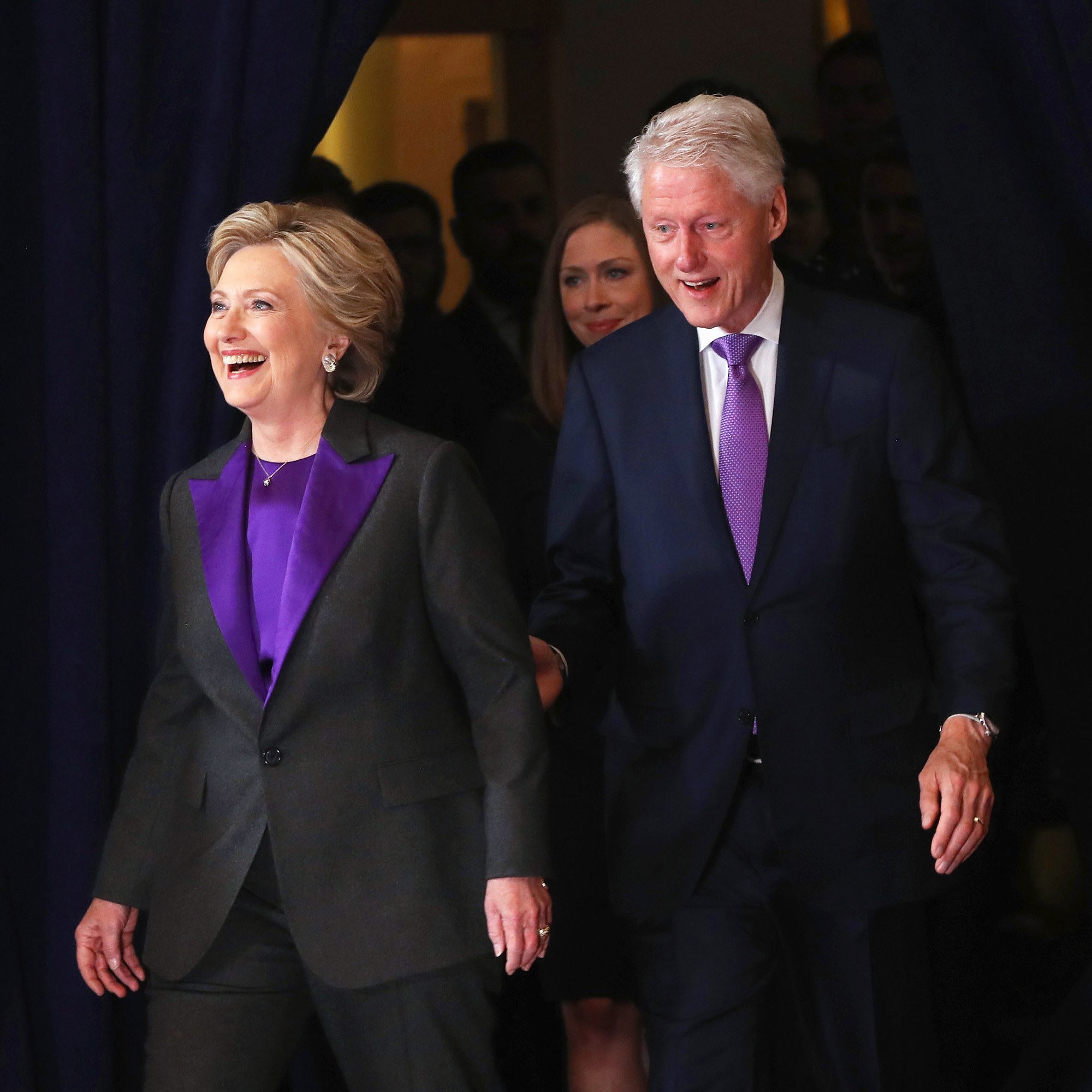
Pantone hopes the blue and red, the colors used to designate America’s liberal and conservative politics, can become a more harmonious purple. Violet speaks to a global audience, not the left (red) or the right (blue), but everyone. Recall the Ralph Lauren ensemble that Hillary Clinton wore to deliver her official concession speech following the 2016 election: a slate grey suit, with a deep purple silk blouse and matching lapels. Clinton later explained the significance of the color in her book What Happened, writing “The morning after the election, Bill and I both wore purple. It was a nod to bipartisanship (blue plus red equals purple).”

Purple has also long stood for sisterhood and solidarity in the struggle for women’s rights, and was the symbolic color chosen by the suffragettes who campaigned for women’s right to vote in the 19th and 20th centuries. It is still used by feminists today as an emblem for the ongoing struggle for women’s rights across the world, and is prominently associated with the annual International Women’s Day. The poem “Warning” by English poet Jenny Joseph begins with the line “When I am an old woman I shall wear purple…” The poem and its famous purple line has become a tongue-in-cheek reference to a woman’s struggle with aging.
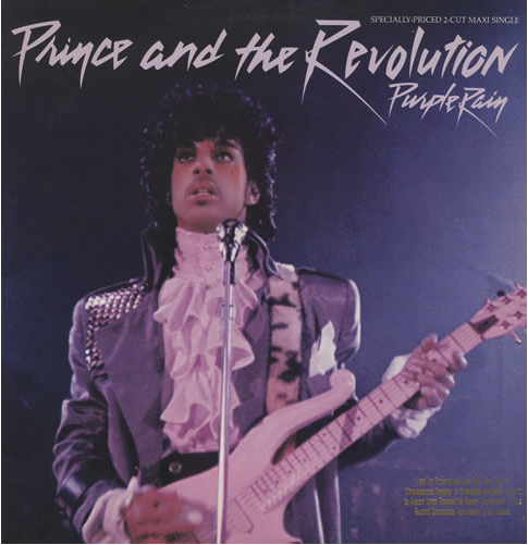
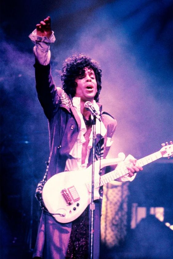
Prince – popstar extraordinaire – laughed in the face of pop since the 1980’s and continually reinvented himself while writing songs about purple precipitation, the symbolic meaning of which still has scholars stumped. He even changed his name to a symbol, for crying out loud. If that isn’t a bold move, I don’t know what is. Prince and other musical icons such as David Bowie and Jimi Hendrix have brought shades of Ultra Violet to the forefront as expressions of individuality and creativity. These artists have been representative of the counterculture – speaking to rebellion, and finding new ways to interpret our lives and surroundings. Ultra Violet promotes mindfulness, spirituality, creativity, forward-thinking, and non-conformity.
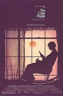
Though unmentioned by Pantone, the choice also calls to mind African-American author Alice Walker’s groundbreaking 1983 Pulitzer Prize-winning novel, The Color Purple, which deals with racism in America. “I think it pisses God off if you walk by the color purple in a field somewhere and don’t notice it.” The color purple is presented as anexample of God-given beauty.
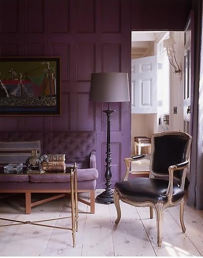
Ultra Violet, Pantone’s 2018 Color of the year has been described as “inventive” and “imaginative,” saying the shade communicates “originality, ingenuity, and visionary thinking that points us toward the future” Regarding interiors, Ultra Violet can transform a room into one of extraordinary self-expression, or conversely its polish can tone down a room with subdued, modern pairings,” Pantone states. Call it purple or violet, this eye-catching hue existing somewhere between warm reds and cool blues isn’t the easiest color to work with in the home, so a little goes a long way. As a color that can take you in so many directions, Ultra Violet makes a statement in any space, whether it’s one of traditionand elegance or unexpected boldness.
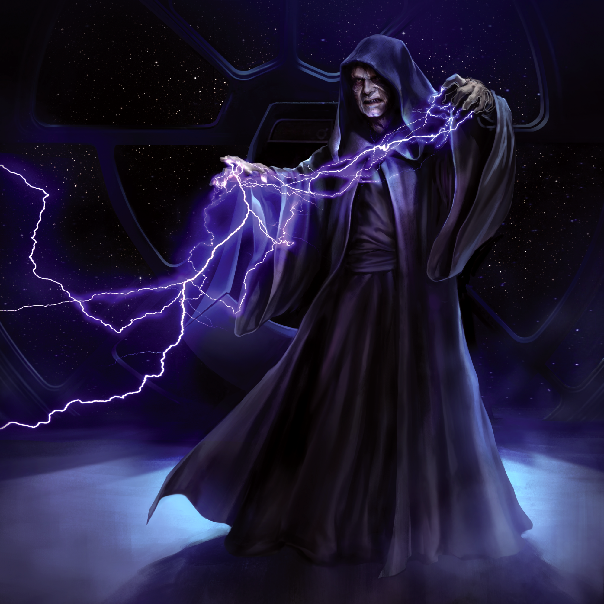
Similarly, it’s also almost exactly the same shade as the purple force lightning that Emperor Palpatine produces in “Return of the Jedi,” but that’s neither here nor there.