Uncategorized

Pantone’s Color of the Year: Ultra Violet

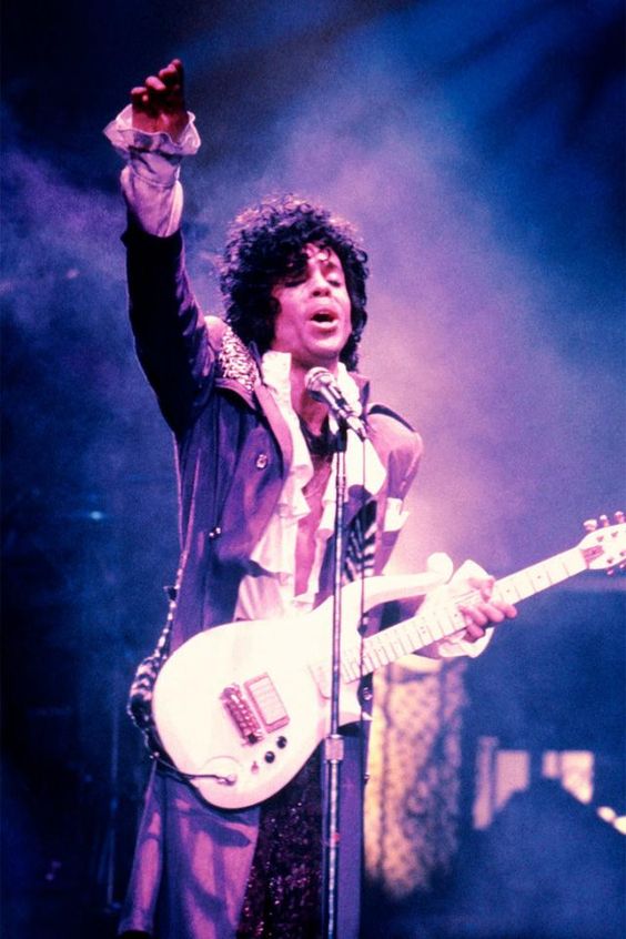
        In 2017, Pantone’s Color of the Year, Greenery was a fresh, invigorating shade of green that reflected new beginnings surrounding the political turmoil of the 2016 Presidential Election. 2018’s Ultra Violet wasn’t chosen for its representation of power and wealth, but was selected to evoke a counterculture flair, a grab for originality, ingenuity, and visionary thinking.   The color violet has been associated with royalty, power, and wealth for centuries. It’s elite status stems from the rarity and the extraordinary expense of dying fabric purple. Since only wealthy rulers could afford to buy and wear the color, it also became associated with individuality, uniqueness, and originality. Today, purple is still regarded as a bit of an “ooh” color. Purple’s rarity in nature and the expense of creating the color and has given purple a supernatural aura for centuries. Perhaps because of its heritage, it has never been a mainstream choice, which is Pantone’s reasoning for it being the 2018 Color of the Year.   Ultra Violet is one of the more complex colors because it is a combination of two shades that are seemingly polar opposites – blue and red – and brings them together to create something new. It also escapes some of the easy descriptions of other colors – red is hot, blue is cool… but what is the quality of purple, exactly? In our current political climate, where red is linked with Republicans and blue with Democrats, purple is periodically identified as a symbol of bipartisanship — or, in the case of swing states, as a signifier of uncertain affiliation. Pantone hopes the blue and red, the colors used to designate America’s liberal and conservative politics, can become a more harmonious purple. Violet speaks to a global audience, not the left (red) or the right (blue), but everyone. Recall the Ralph Lauren ensemble that Hillary Clinton wore to deliver her official concession speech following the 2016 election: a slate grey suit, with a deep purple silk blouse and matching lapels. Clinton later explained the significance of the color in her book What Happened, writing “The morning after the election, Bill and I both wore purple. It was...

Design Trends: Maximalism

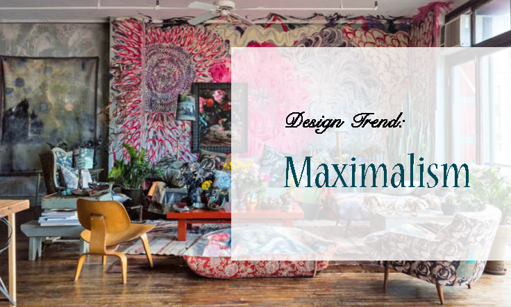
Minimalism has dominated the modern design world for far too long. For years, designers have adopted the ideals of elegance and simplicity.  We’ve lived in the era of social media, embracing the Apple aesthetic, Helvetica font, and white walls. But whatever happened to bright colors, bold patterns, and your good old fashioned knick-knacks? If Marie Kondo’s “less is more” mentality is your idea of creative expression hell, you aren’t alone. There is a shift in desire to create spaces that don’t attempt to show the Instagram-worthy, picture-perfect environment. Many designers have been restless for change, and ready to take risks by welcoming the messy world of color, pattern, and texture. Less is a bore, more is more. Maximalism, while being the complete opposite of minimalist design, doesn’t necessarily imply clutter or that you’ll eventually end up on an episode of Hoarders. Maximalism is the idea of excess, luxury, and individuality. In an age where the internet has us communicating in all-caps, LOLs, and emojis, it’s no surprise that our sense of style has evolved to become just as hyperbolic. The trend is particularly taking hold in the interior design world, where we’re starting to see more bold upholsteries, elaborate patterns and embellishments. I myself am a big fan of the maximalist lifestyle, boasting mismatched furniture, numerous artworks created by friends, and countless candles that dominate my home. Whenever I am entertaining, visitors always comment on the surplus of doodads to look at, variety of soft blankets and pillows, and the overall cozy nature of the space. If I'd decorated in a minimalist style, there would be far fewer conversation pieces.   Here are five ways to release your inner maximalist:     I. ENERGETIC COLORS: Forget about those stark white walls, and embrace a bold and vibrant hue. While minimalism uses pops of bold colors here and there, maximalism embraces the use of color.         II. BOLD PATTERNS: From the window to the wall, pattern can play a role anywhere in the room, but the layering of pattern on pattern may seem easier said than done. Pattern can seem overwhelming at first, so try starting small by incorporating some patterned throw pillows. Embrace the...

Doughnut Dynasty at PIX-US

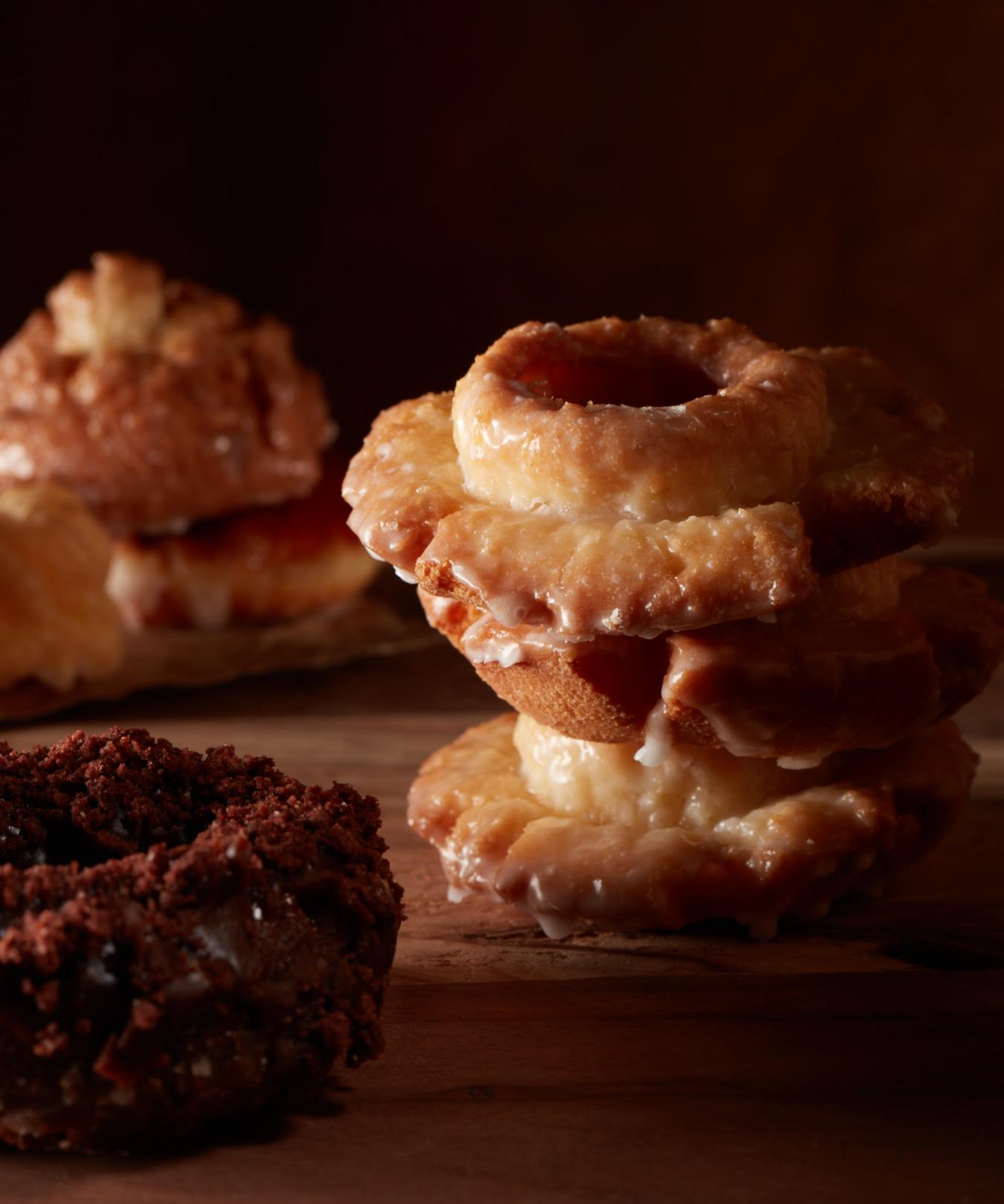
One cold, January day PIX-US partner Mark called up his marketing guru—that’s me, Annie—and started (without saying hello) reading some very familiar words. “Hey,” I said. “How do you have that? It’s not going to be published until February.” Mark just kept reading. Then, since we have a solidly collegial rapport, I said, “I can’t tell if you’re making fun of me, if you really like it, or if you just want a doughnut.” Finally, Mark said that Andie Rose at O.Henry Magazine had asked him to photograph the cover story I wrote about the boom in Greensboro doughnuts shops—a doughnut renaissance if you will. We’d had a conversation about the magazine days before, but neither of us knew we’d been assigned to the same piece. I’d already involved a lot of my friends via Facebook asking for their favorite doughnuts and places to get them, inviting them to taste test with me. Clearly, Mark stopped following me, or he would’ve known the story was mine before looking for the byline midway through his first reading. Just saying. Once we finished laughing at ourselves, the team felt compelled to have our own taste test in the name of science—and photography—of course. Stewart’s obsession with apple fritters got the entire staff hooked, making them the official doughnut of PIX-US. One of the primary results from the test was that Rise, the new shop at Friendly Center, has the best fritters in town—“made with apples, not apple-pie filling.” You might say we were frittering our time away eating them. We bought three dozen doughnuts for the photo shoot, and clean up was a breeze. Somehow, by the end of it, nearly all of them had disappeared. Mmmmm. Donuts: Check out the full story in O.Henry Magazine....